In the nineteenth century, to accommodate the many people who could not afford a broad piece of land on the avenues, urban builders put up apartment buildings on long narrow lots. These apartments became known as railroad flats, one room wide and three or four rooms long. To reach the bathroom at one end, you have to go through several other rooms. Though railroad flats are large in terms of square feet, their proportions are extremely awkwardâ€â€they are much too long for their width. Railroad apartments violate the attributes of human scale and proportion.
When you encounter a space or an object with awkward proportions, whether it’s too long for its width or top heavy, you will feel a certain uneasiness. For example, it is never appropriate to cut out a rug around a hearth. The cut-out area violates the proportions of the rug, causing you to feel uneasy. A rug should be a smaller version of the room’s dimensions, echoing the overall shape of the room. Always scale down the rug size so you maintain the classic proportions of the rectangle.
When people see objects that are offensive to their eye due to poor proportion, they often become frustrated and tune out because they don’t know how to make it better. They shut their eyes and turn their backs. But flawed proportions can be corrected in many instances.
Using Mirrors to Correct Bad Proportions
Unlike our bedroom, stuffed with a modern furniture, the entrance hall of our apartment does not have gracious proportions. The space measures 8 feet     inches X 23 feet 5 1/2 inches, much too narrow for its length. The ratio of height to width is also a problem: The width of the main hall is less than its height by almost a foot. (Whenever possible, the ceiling should never be higher than the width of the room.) By multiplying the actual width by 2, the visual measurement becomes 17 feet 3 inches X 2 3 feet 5 1/2 inches, a fat rectangle satisfying to the eye. When we have receptions in the apartment, everyone likes to gather in the hall because it is pivotal to entering and leaving other areas of the apartment such as the library, living room, kitchen pantry, and bedroom hall. The mirrored wall is a brilliant way to create a golden mean of proportion, fooling the eye to achieve a feeling of harmony.
Here are some other ideas for using mirrors to correct awkward proportions:
♦ If you have a long narrow hallway, place a mirror at the end of the hall to bring in light and visually widen the space. You can either hang a traditional mirror in a frame or mirror the whole wall from cornice to baseboard.
♦ If you have a long dark room, place a mirror or pair of mirrors on the long wall to break up its length. Windowpane mirrors will fool the eye into believing that you have two additional windows, creating more space and light.
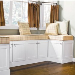
 If you are fortunate enough to have a window seat, give it the same respect you pay your living room sofa. First, hang shades or curtains in a neutral color and style, so your window seat will be the star. Have the seat cushion made fat like a 3- to 4-inch thickness with a crown, or a graceful bulge, in the middle. Run contrasting welting or moss fringe along the seams. Order a bolster for either end.
 A child’s first room needs to be bright and stimulating as well as practical. Careful planning means it can be easily and inexpensively adapted as the child grows, like this room where a row of simple cupboard units provides not only ample worktop surface for changing nappies, but will later be useful for play, study and storing clothes and toys. The room has a red, yellow and green colour scheme: naive flower design on white for the walls, a larger splash of flowers on the window blinds and a red and white grid design vinyl on the floor - all easy-to-clean and practical.
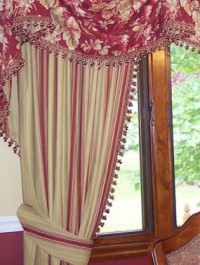
 Good construction, all by itself, can make a simple drapery look expensive. I know a designer that makes plain, unpatterned curtains in a neutral colorâ€â€but when he gives them an 18-inch weighted hem, a quiet grandeur emerges. (Ask for headed-chain weights when the curtains are made.) Have the drapery lined and interlined. It will look rich and heavy and it makes the sound in the room very peaceful and soft.